Roya Taylor
Genre Unannounced / Unity
• Working with a renowned external partner
• Designing game features and documentation
• Engaging in multidisciplinary collaboration
• Details under NDA
Behaviour Interactive / Game designer

2.5D Platformer / Unreal Engine 5
• Performed second pass iteration of game Hub world; improving and iterating on existing layout and suggesting improvements for flow, pacing and metrics
• Blocked out sprawling level design made up of uniquely themed sections, ensuring cohesion
• Designed optimal level flow through use of golden pathways and element composition
Chokepoint Creative / Game designer
Soulslike Action-rpg / Unreal Engine 5
• Planned, built and iterated on an interesting and visually compelling environment through analysis and research; from paper designs through to a final polished level
• Designed the level with enemy placement and strong encounter design at heart
• Utilised a good visual eye for scene setting, sight lines, vistas and areas of interest
INFINITY27 / Level designer
PS1-style found footage horror / Unreal Engine 5
• All level designs based on historical research and architectural studies
• Immersive first-person story and dialogue relayed through interactive game world
• Distinctive PS1-era visuals and sound design to enhance horror
Solo-developed indie game / All roles
Multiplayer arena brawler / Unreal Engine 5
• Designed all gameplay mechanics within documentation
• Blocked out an arena level design with multiplayer focus
• Scripted environmental hazards and world events
• Created all front-end menus and HUD design
Team of 10 / Level Design, Gameplay Design
Action-adventure RPG / Unreal Engine 5
• Scripted narrative dialogue system and wrote all dialogue in Twine
• Blocked out main village level design and designed game world, NPCs
• Crafted all cinematics using Unreal's sequencer tool
• Project Lead and Design Lead
Team of 20 / level design, narrative design
FPS / Unreal Engine 5
• Designed mission flow and pacing
• Blocked out level and scripted gameplay events
• Designed and scripted enemy encounters
• Narrative design and cinematic design
Solo project / Level design, Mission design

Profile
Roya Taylor is a northeastern English-Persian game designer specialising in the level design, narrative design and quest design roles. She is currently working an internship as a Game Designer at Behaviour Interactive's UK North studio on an unannounced project.
After 5 years in games education, she holds a Level 3 National Extended Diploma in Games, Animation and VFX with Distinction from Sunderland College, and a Bachelor of Arts in Games Design with First Class Honours from Teesside University.
"I am deeply passionate about video games and design. My years of education, long nights spent crafting personal indie projects, and my first professional roles in the industry have taught me how to channel this passion to make myself a bold designer, ready to take risks and challenges head-on. I consider myself to be highly creative yet disciplined, combining my love for immersive and narrative-rich experiences with analytical and problem solving skills."

Industry contributions
Women in Games Ambassador
JAN 2026 - PRESENT
• Acting as a role model for Women in Games’ values, purpose and mission
• A visible member of the community others can look to for guidance, support and inspiration
• Involved in Women in Games projects, events and activities
• Activist and advocate for the empowerment of women and equality in the global games industry
Blog post for Behaviour Interactive
INTERNATIONAL WOMEN'S DAY 2026
The Cairnholm Tape
PS1-style found footage horror game
Level design / Quest design / Narrative design
Project stats —
• Created solo during my final semester of University
• Developed in Unreal Engine 5.4
• Single player, first person
• Around 10-15 minutes of gameplay
• Graded a First by my tutors, 86.57%
Stating my initial intentions —
• Breaking down how to achieve optimal game flow through strong quest design
• A level design that encourages exploration and is grounded in real-world inspiration and architecture
• A narrative that generates intrigue and feels organic through real historical research and visual storytelling
Quest beat breakdown
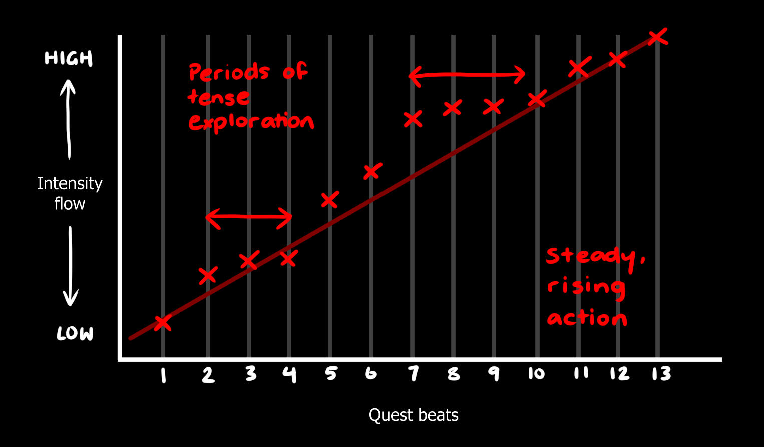
1. Harlan turns on the camcorder and begins his journey into the abbey grounds
2. He discovers a newspaper in the car park detailing the closure of Cairnholm Abbey and its missing persons cases
3. He moves on to the graveyard and reads the story of Alisander of Cairnholm
4. Now Harlan is entering the Abbey proper, beginning deeper exploration
5. Upon entering the cloister, he is greeted by the first bloody message on the wall
6. Harlan learns the history of the Abbey monks and their shared hysteria
7. He finds the key to the archives next to a second bloody message
8. In the archives, he learns he needs to place 3 special items around the cloister statue
9. He also finds the key to the locked warehouse in the car park
10. Harlan exits and backtracks to the warehouse to find the silver
11. Upon exiting the warehouse, he is confronted by the vampire Alisander
12. He runs quickly to the forest to find a wooden stake
13. When Harlan arrives at the statue, Alisander is waiting for him - the video stops
Level design
Narrative techniques and mechanics
Art and in-engine visuals
Cosmic Clash
Multiplayer arena brawler
Level design / Gameplay design / UI design
Project stats —
• Created in a team of 10 during final year of University
• Developed in Unreal Engine 5.4
• Functioning online and local 2-4 player gameplay
• 5 minutes of gameplay per arena
• Graded a First by my tutors, 88%
Stating my initial intentions —
•
•
•
Samsara
Soulslike action-RPG by INFINITY27
Level design
Project stats —
•